Embassy Eden
Brand Identity
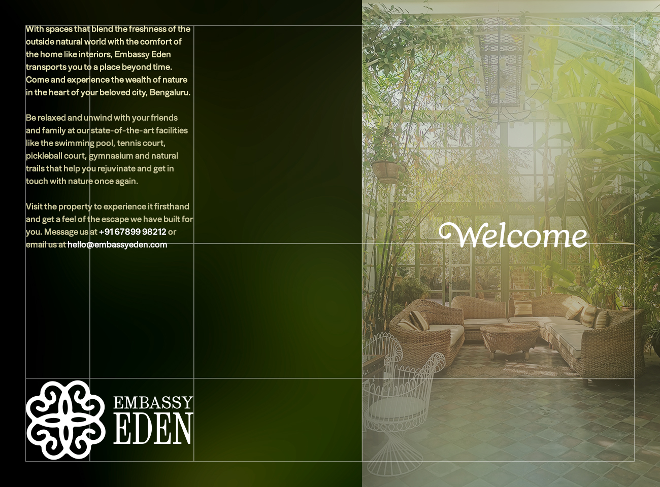
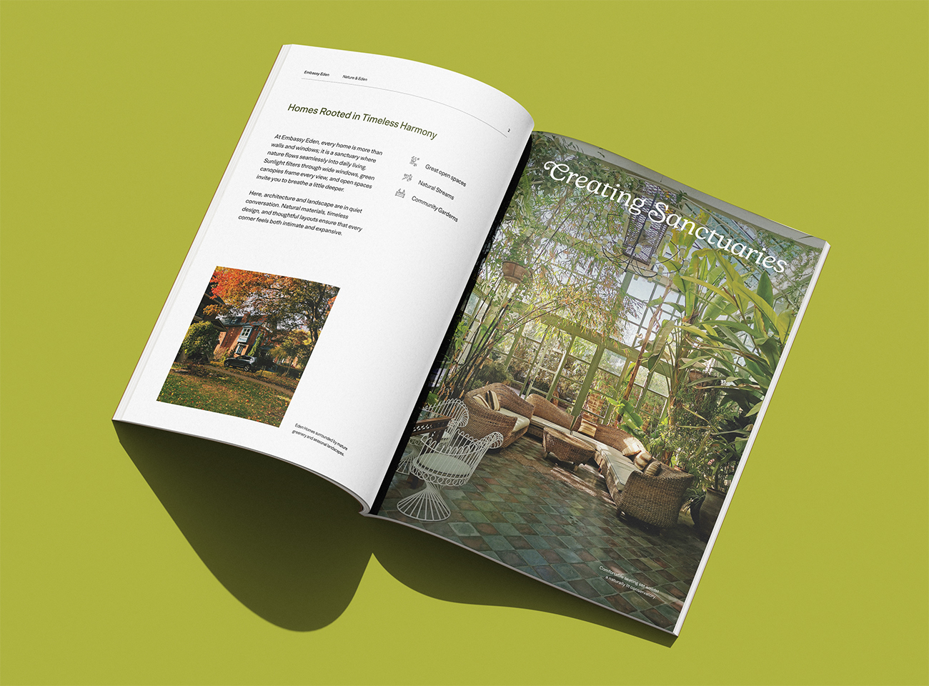
Embassy Eden is a luxurious housing township on the outskirts of Bengaluru, built by Embassy Group. The property is surrounded by lush foliage and pristine natural spaces that separate it from the main city.
As a Senior Designer at NU Branding, I worked with Manpreet Seera to develop an identity system for Embassy Eden. As the property was inspired by 'The Garden of Eden', the identity was inspired by timelessness and tranquility which are part of Eden.
Year
2025
Collaborators
Manpreet Seera
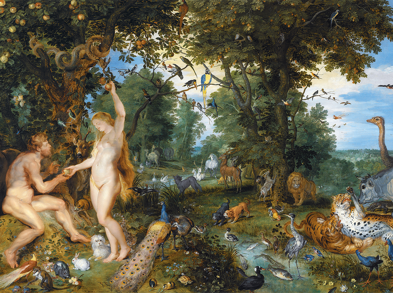
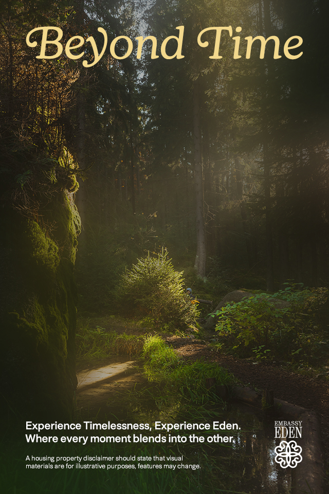
Embassy Eden takes heavy inspiration from 'The Garden of Eden'. To position the property with regard to others in the district, we used the timelessness and tranquility as guiding principles. We built on the idea that the Garden of Eden is beyond time, with plenty of resources and no worry of any kind.
Image from Wikimedia Commons.
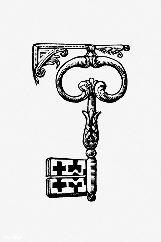
The idea of nature and home combine in the form of ornate keys used in the Victorian Era. Their forms inspired us to create an identifier that reflects the natural touch present in the homes at Embassy Eden.
Image from Wikimedia Commons.
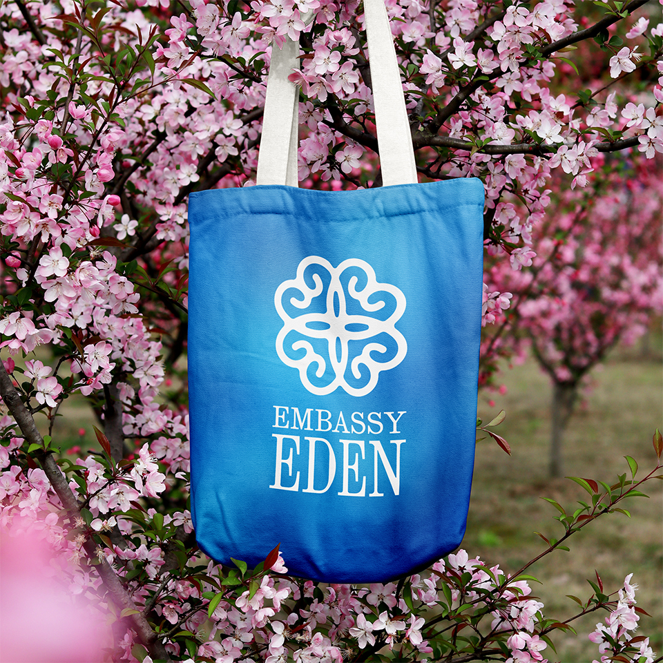
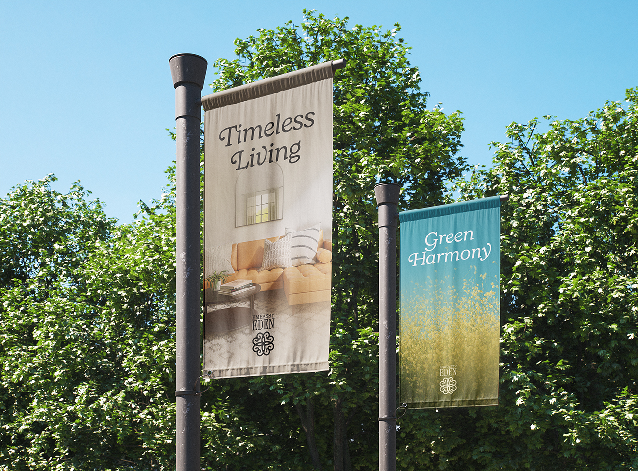
We used a simple four clover leaf outline to create the ornate pattern that forms our symbol. It was paired with a rounded serif font to form the primary identifier. Its symmetry allows us to use it in a variety of combinations.
As 'The Garden of Eden' is a divine place, we used the God Ratio or the Golden Ratio to guide our grid systems. We were also careful in using some randomness as nature does not follow a set pattern.
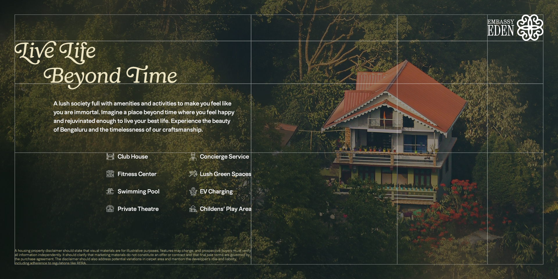
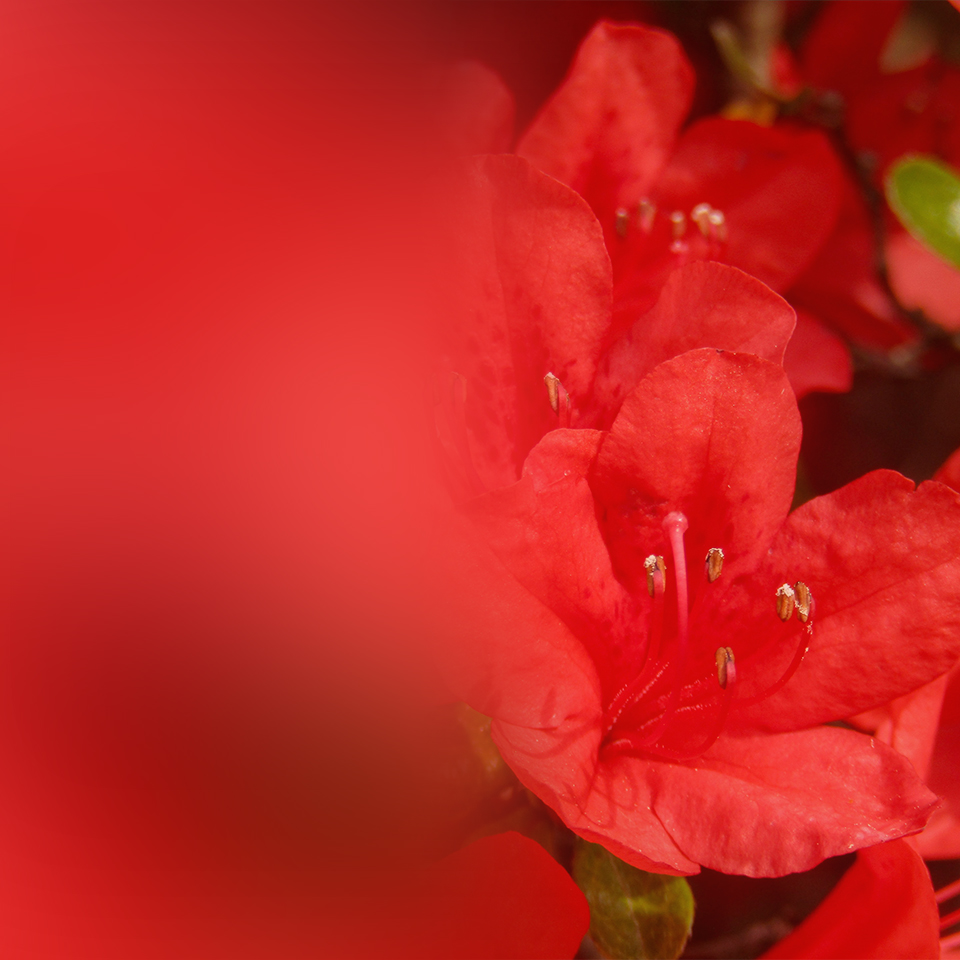
The colours were inspired by the vibrant shades of flowers found in The Garden of Eden. Instead of selecting a singular colour, we chose to use gradients that change naturally to adjacent colours to embody the feeling of continuity of the space.
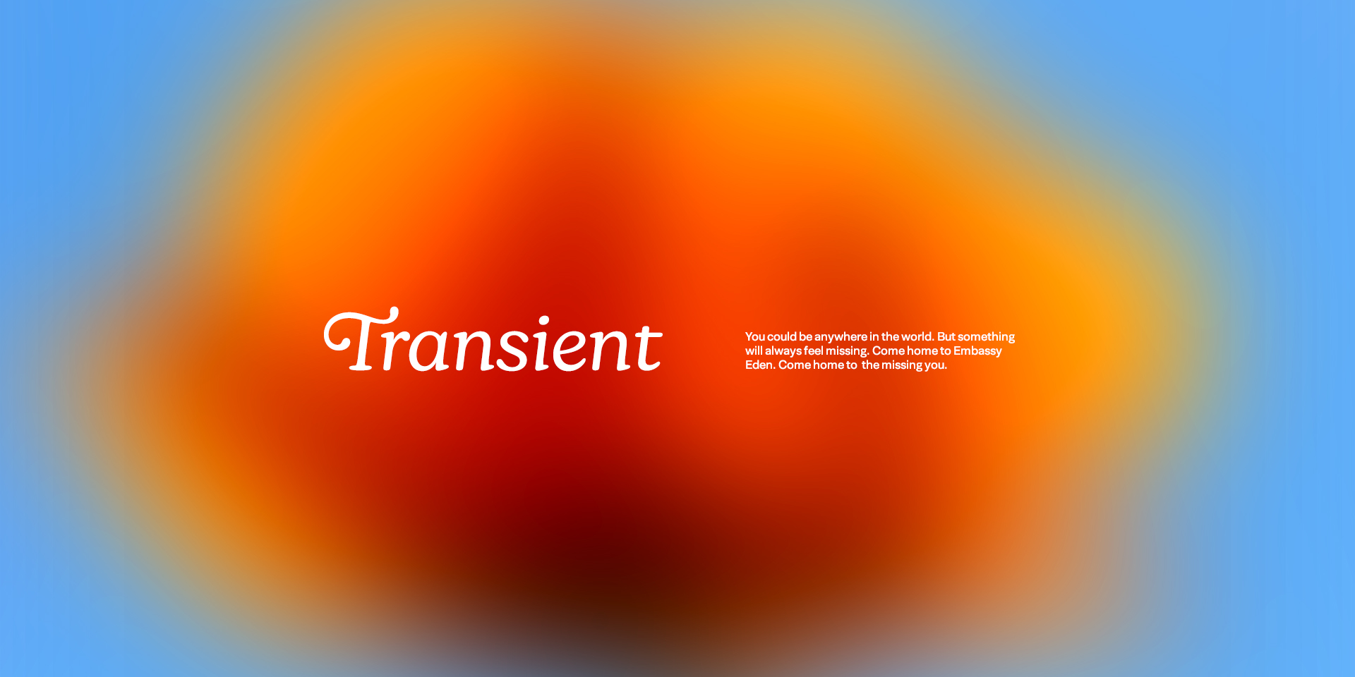
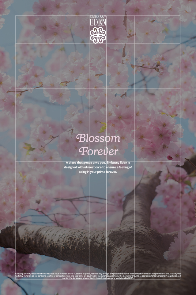
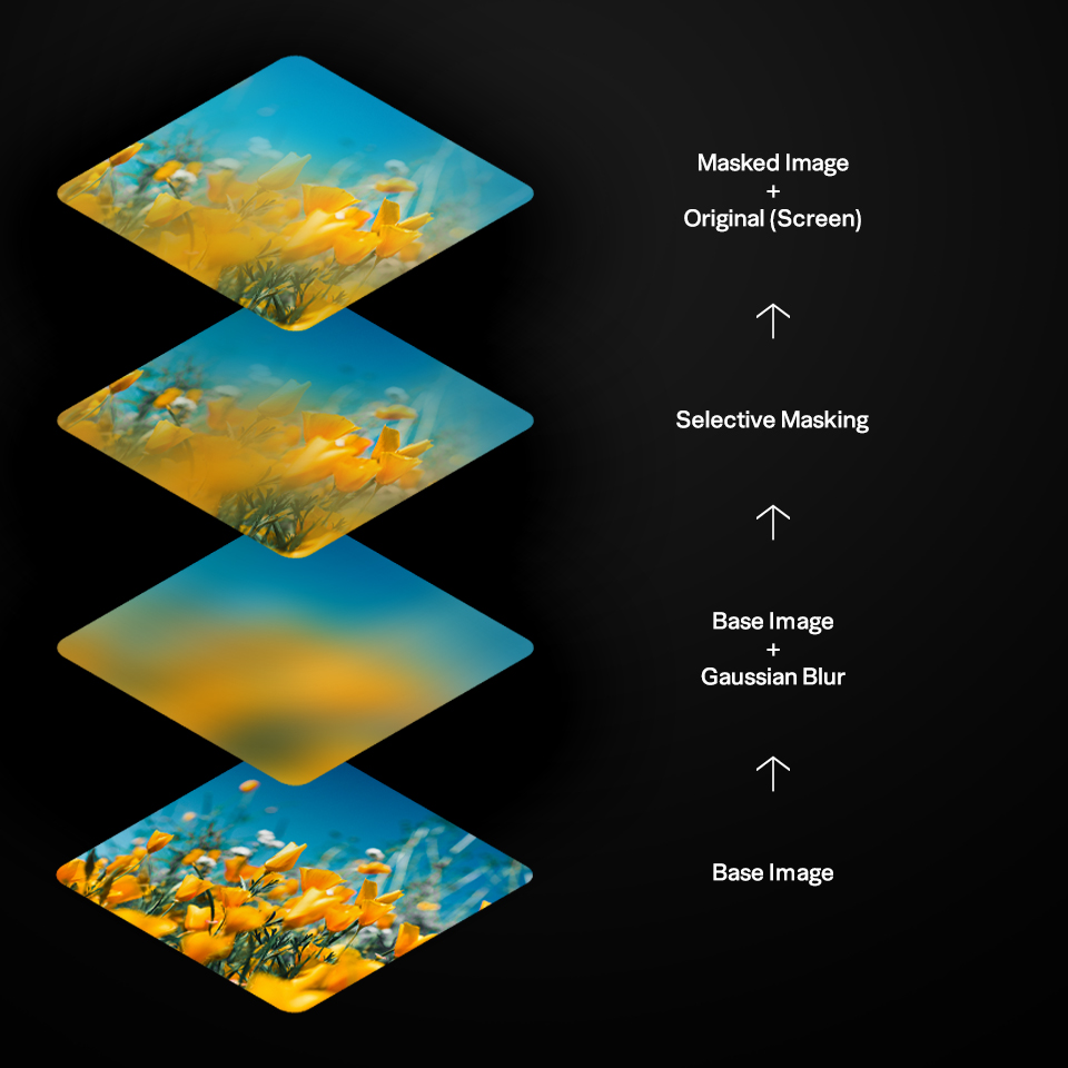
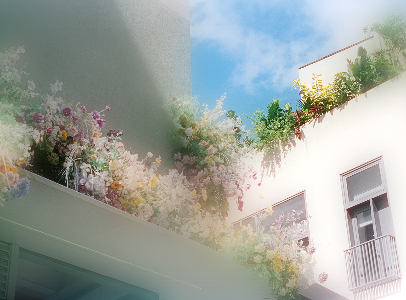
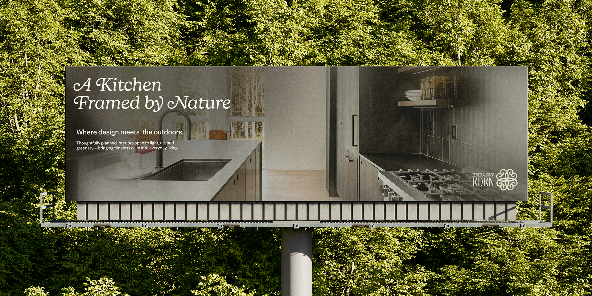
With photography too, we wanted a dreamy aesthetic. We achieved this by blurring parts of the photo and adding some blooming effect to the lighting in the image that made them feel like visuals from a dream.

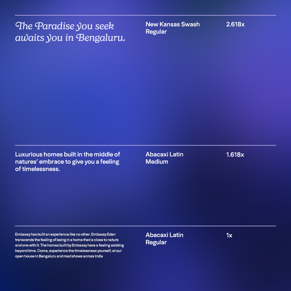
The typography for Embassy Eden is kept fairly straightforward. We have used New Kansas and Abacaxi Latin as the typefaces for the brand. The golden ratio dictates the relations between the different font sizes.

I am a Graphic Designer, Photographer & Art Director from Mumbai, India.
Services
Brand & Identity Design
Website & UI Design
Editorial Design
Environmental Graphics & Wayfinding
Photography & Art Direction
Contact
Interested in working together? Feel free to reach out and discuss your ideas to see what we can bring to life.
© Soham Khadatare 2026
Mumbai, India